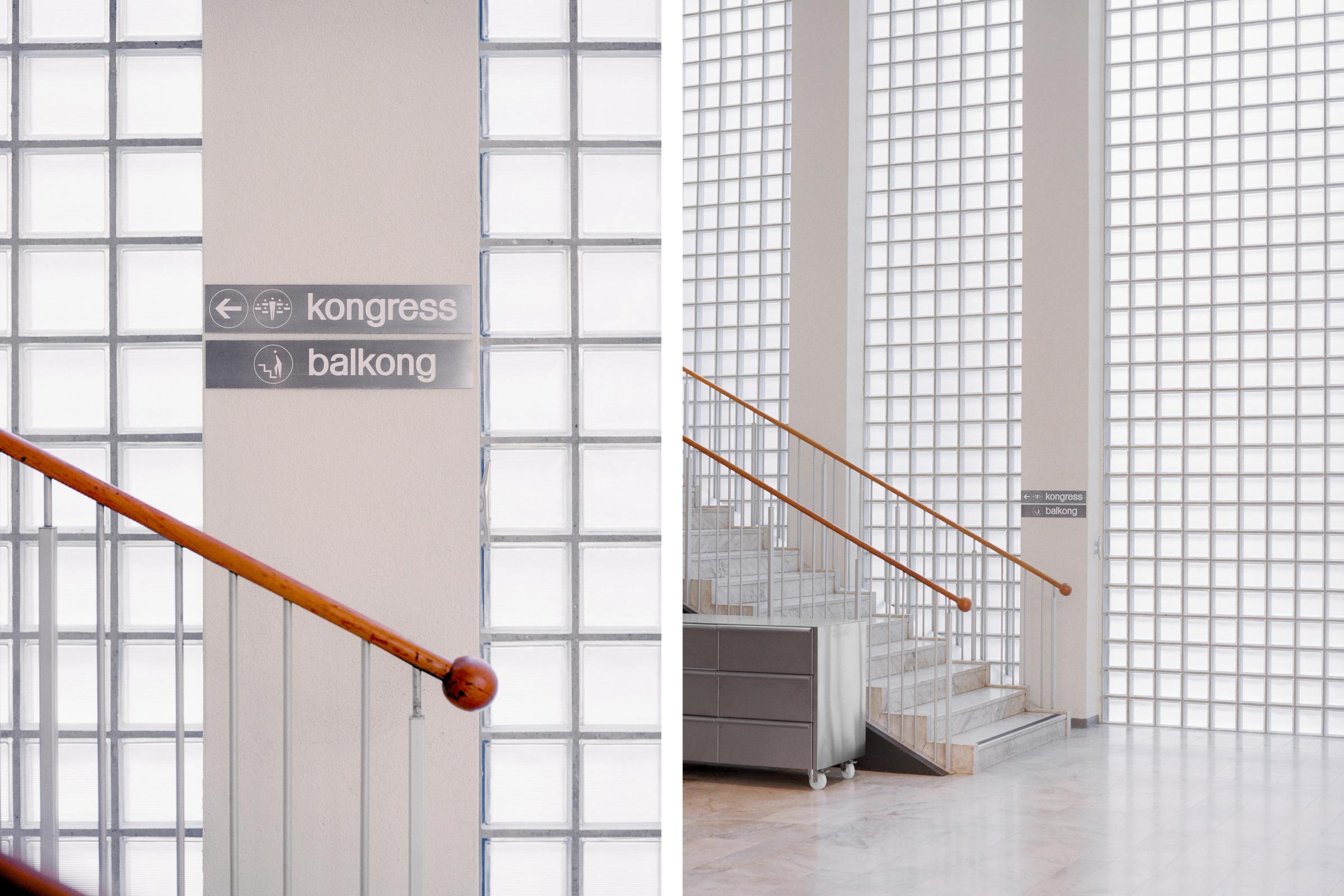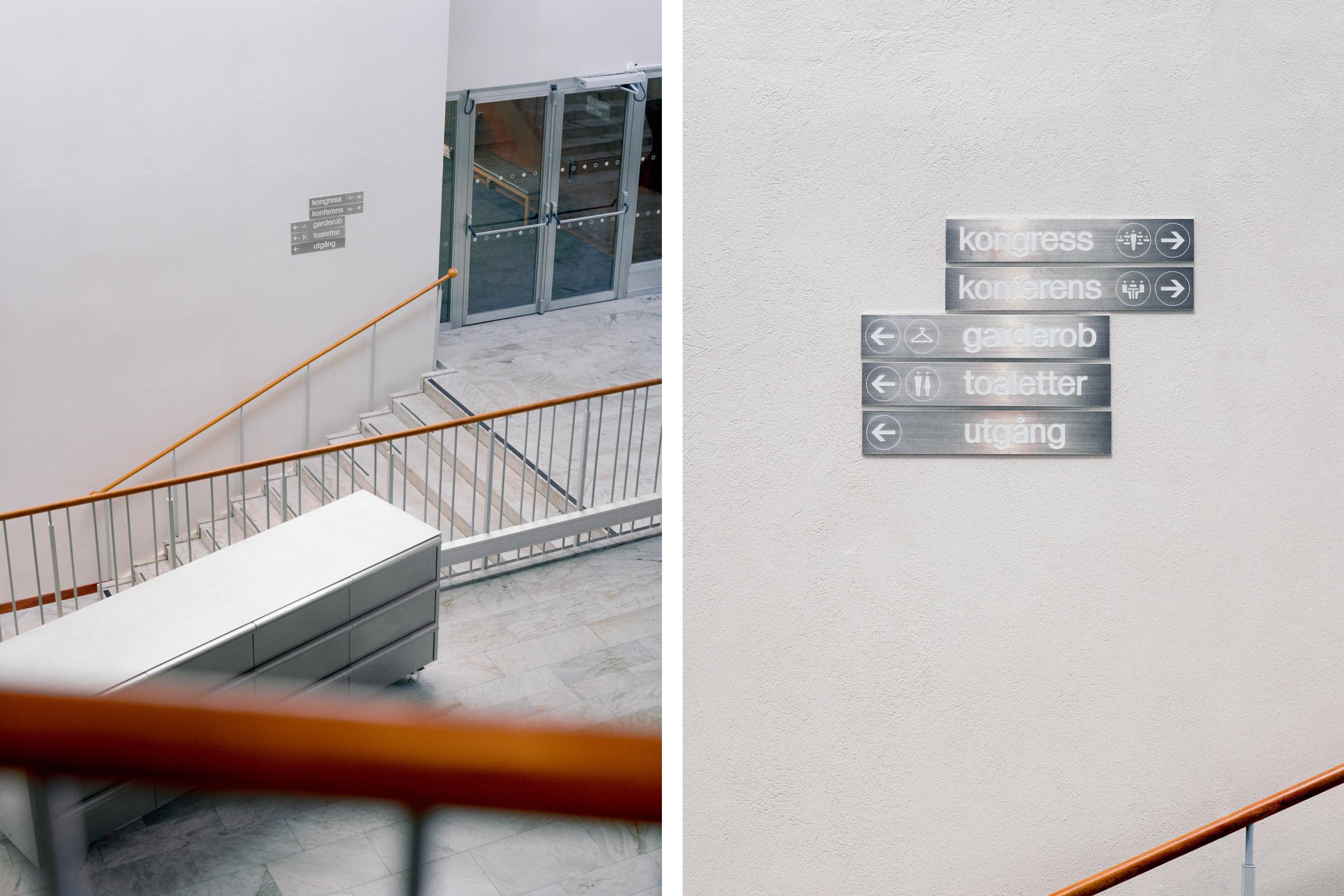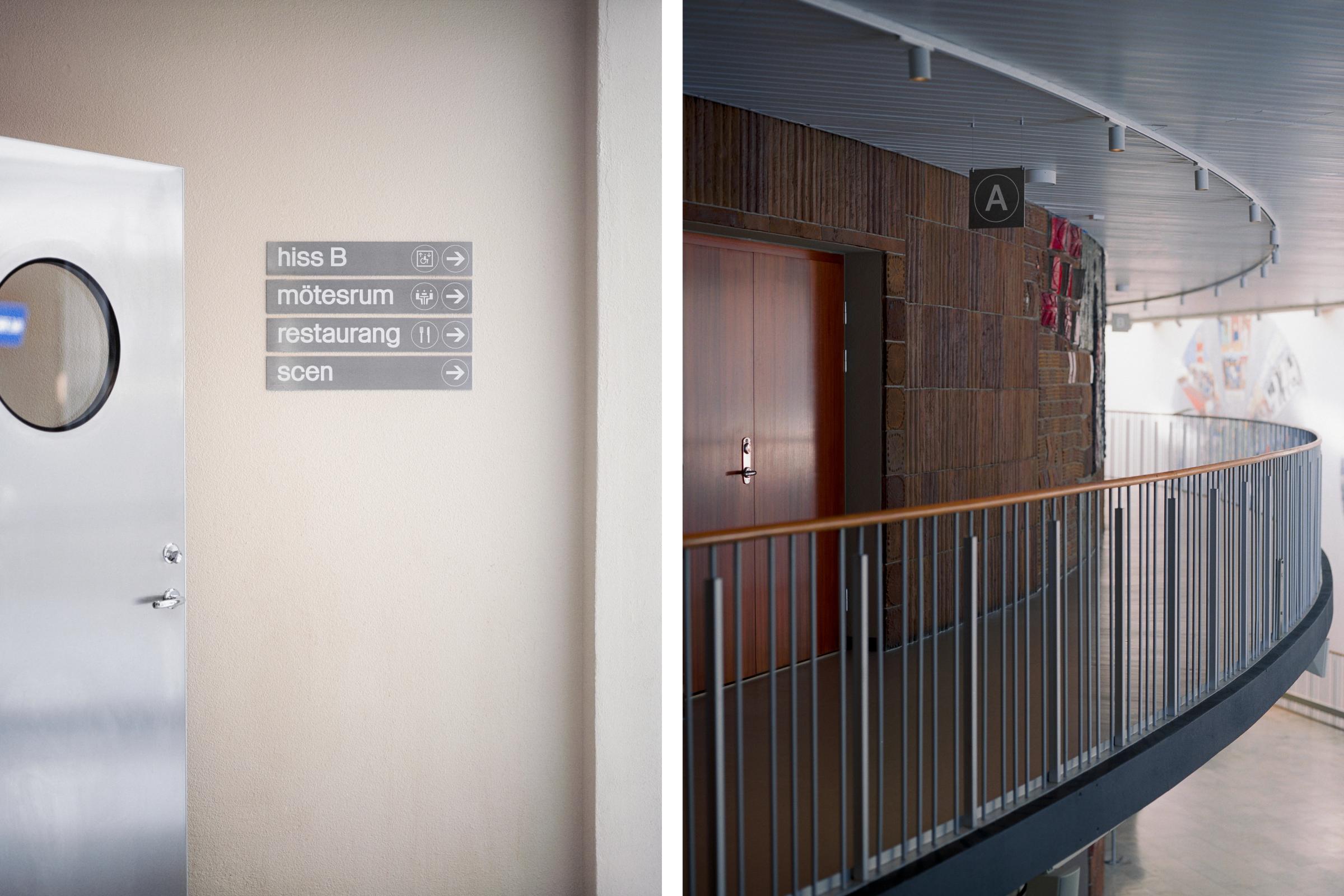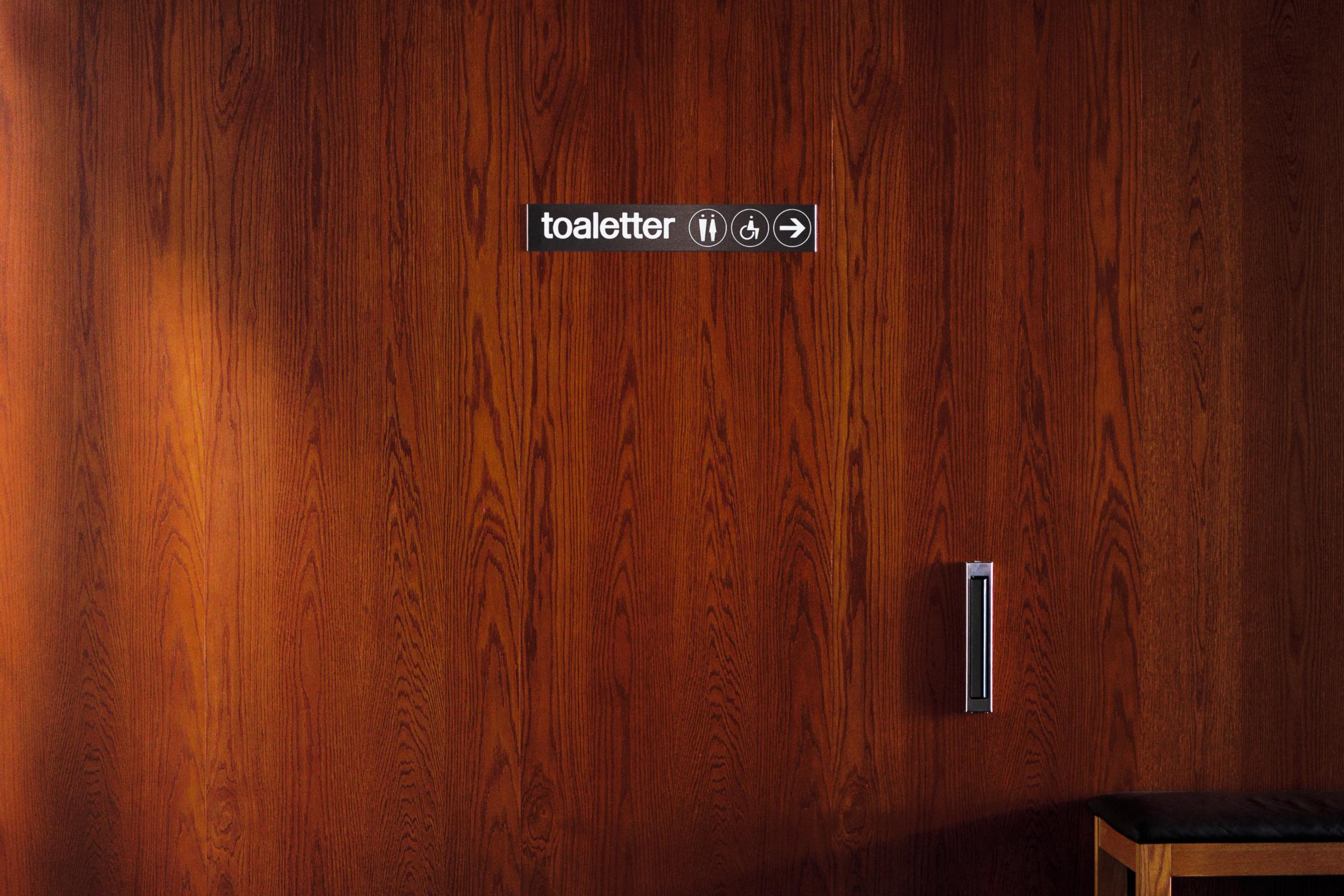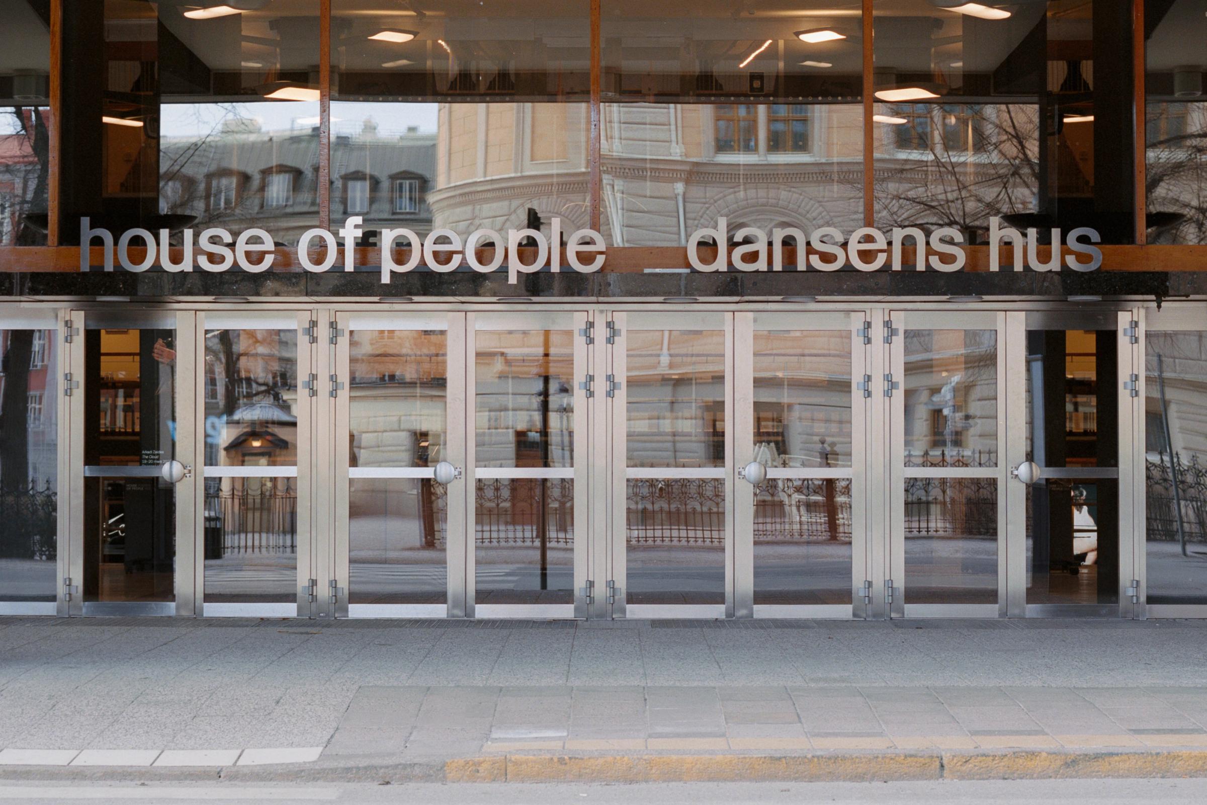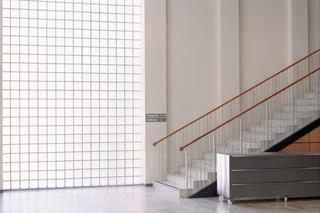
Signage system for Folkets Hus, the functionalist masterpiece designed by architect Sven Markelius in 1960.
The last remaining original sign from the 1960s informed every decision in the creation of the system: 1. TYPOGRAPHY 2. PICTOGRAMS 3. MATERIAL
TYPOGRAPHY
Together with @lettersfromsweden, we developed Markelius Sans — based on the hand-drawn interpretations of Helvetica found in the archives of Folkets Hus at Norra Bantorget in Stockholm. Among architectural drawings and signboards, these letterforms were discovered. Each character was digitised directly from the source material, while missing characters were drawn to follow the same underlying logic. Following the same decision made 66 years ago, the new wayfinding is set in lowercase throughout the building.
PICTOGRAMS
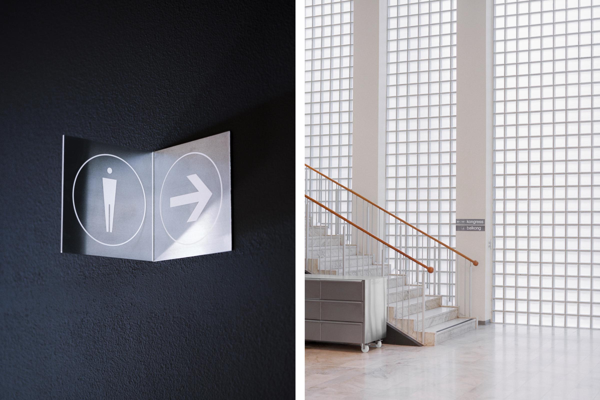
The dancing figures on the original sign, with their characteristic shapes and proportions, became the foundation for the wayfinding pictograms. Taking a more rigid approach while preserving the same proportions and character, an additional set of pictograms was brought to life.
MATERIAL
Nothing added. A single sheet of raw aluminium is used throughout the system, with white lacquered debossed graphics. With its natural beauty and shine, the wayfinding both stands out and blends harmoniously with the environment — balanced alongside the single-sheet metal furniture, ceiling and doors by @dinelljohansson